Your Rubicon Moment of the Day, Episode 2
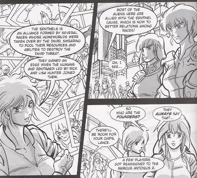
Shame I couldn't find another moment as perfect as the first, which reads almost like a strange unfunny webcomic, but I don't think there is a moment in the series that encapsulates all that's wrong with it as much as Ariel spazzing out over a saucer floating in zero-g. She's written as a total flake all through the first issue of Rubicon, which is just totally off base when compared to her portrayal throughout the end of the New Generation episodes of the TV series. In fact, there's a lot of bad characterization going on in general, but there's also some odd presentations of series history as well, which brings us to today's panels, again, from the first issue:

Observation 1: No Sentinels designs in the flashback photos in the first panel -- Rick and Max look like Macross Rick and Max with some subtle age lines and vaguely drawn non-Macross but non-Sentinels uniforms. And see that person with the cyborg eye right to the left of the speaker's word balloon? What the hell is that? Was Sentinels reference art that hard to come by?
Observation 2: In a panel talking about the aliens that are here, look, no aliens! In fact, not a single identifiable Sentinels alien appears in the two published issues of The Sentinels: Rubicon. (See question above.)
Observation 3: Notice the mention of the starship Marcus Antonius 2 in panel three -- correct me if I'm wrong, but isn't that an artifact of the work of Pieter Thomassen, Peter Walker, and the rest at the Unofficial Robotech Reference Guide? In their files, that ship's namesake was a Tokugawa-class vessel that ferried Jonathan Wolfe back to Earth, as you can read here; I believe that originated with them, because I don't recall seeing the name in the novels, comics, RPG, or anything else officially published.
Also, the two girls' dialogue in the last panel reads so strangely; if you think about it, it does make sense, but at first glance it almost seems like a non sequitur. Also, I don't know about you, but when skimming over the panel it almost looked like Meg was saying both lines, which would be even stranger. Any way you slice it, those are some badly laid out word balloons, and the words inside them aren't much better.
Obviously writer Alan Nepomuceno sort of gets Sentinels, or at least the broad strokes of it; the notion of the Sentinels Alliance outlasting the campaign against the Invid is one I've always favored, and has apparently been maintained in the current official ROBOTECH universe according to Prelude to the Shadow Chronicles (one of a small handful of obvious beats appearing in Rubicon that are echoed in Prelude, which despite their being obvious still reads as odd). But the artist is totally lost when it comes to dealing with Sentinels stuff, as becomes increasingly clear as the soap operatic, multi-threaded storyline wears on -- there's only one Sentinels design that winds up looking right, and it's an odd one, which we might get to later this week.
More awfulness tomorrow! Woo-hoo!


1 Comments:
Panel one, Meg has got some seriously messed up proportions too. Her breasts look like triple D's, her close forearm doesn't look like it attached to her body, her head looks too small in relation to the rest of her body( especially with it being a 3/4 down shot)....yikes.
the thing with the cyborg eyepiece: the only thing i could think of was that it was an EAR piece instead, but whatever, it's odd to be sure.
By Anonymous, at 27 April, 2006 15:17
Post a Comment
<< Home