I dunno, what do YOU think?
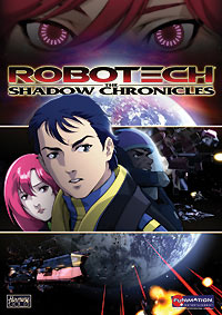
 This is the new Shadow Chronicles DVD cover that popped up at Right Stuf oh-so-recently. With the movie in mind, I think it's a interesting, only slightly inaccurate cover -- honestly, Vince Grant, hidden behind his Cyclone armor helmet next to a decidedly off-model Scott Bernard (it's New Gen Scott Bernard's head with Shadow Chronicles Scott Bernard's hairdo), felt more like the main character of The Shadow Chronicles than practically anyone else in the movie -- Vince's story is the most compelling, and he's got a ton of screen time. Bernard is plenty key, though, moreso than any of the new characters; he earns his spot here, but I think he should be a little bit smaller. There should be more of an ensemble thing going on, not a "starring Scott Bernard" thing.
Despite all quibbles with the cast lineup, I do really like the layout of the piece. I'd personally move the logo up a smidge higher, more evenly between Janice's eyes and the top of Bernard's head, but otherwise I certainly wouldn't mind seeing this image every time I pulled out Shadow Chronicles to give it a spin in the ol' DVD player.
What do YOU guys think? Good? Bad? Ugly?


8 Comments:
It looks good, Scott IMO looks very nice, and of course that's why it was used and accuracy went out the window.
By Anonymous, at 19 November, 2006 04:04
Using a more New Gen Scott is more likely to strike up a familiar face in the memory of old fans. Too bad they did not use that face for the whole movie.
I like the top two thirds, but the bottom panel is just not right for me. I would like to see the ship larger not too bigger and more of an angle. And maybe loose the lasers and explosions. The lasers and explosions are more of a distraction and introduce strong eye grabbing colors. This forces attention to be drawn away form Scott and company. IMHO I believe the strongest use of reds and yellows should be reserved for the logo and characters. Think I'm crazy?, just cover one eye and move your hand over the lower left corner. Notice how you eye and attention will jump to Scott. Another option is to just create a new layer in photoshop and draw over it with black.Toggle the layers and watch the your eye jump. Now if the lasers and Explosions must stay I hope they will at least knock the saturation down to to levels closer to that of the ships, characters, and the reds and yellows in the logo.
So why don't have I have issue with the eyes above earth? The eyes above earth are within the color palette of the poster and balanced by Ariel's hair color, the glow above the earth and lastly the hull of the lower ship.
I keep writing posts like this I might have to start a blog.
By Anonymous, at 19 November, 2006 07:42
I definately would have moved the logo up more so that it wasn't just touching the top of scott's head. In the animation community, that's what's known as a bad tangent, or connecting intersection, that should be avoided just for aesthetic appeal, and so the logo doesn't look like its 'resting' on the head. Ah well.
By Anonymous, at 19 November, 2006 13:49
Like Odyn said, I wish they had used that actual design throughout the movie. Obviously they're trying to hit some sort of nostalgic factor, and the new Scott doens't really do it. Maybe if they put the new Scott in the old armor that would have worked better.
I don't so much as mind the eyes on the top, but more emphasis should have been put on the mecha. My only complaint about those eyes is that the red hair on both Janice and Ariel make them look too similar, which is evident when they stand side-by-side in the movie (with nearly identical cleavage cuts on their dresses, no less).
Anyways, this is far better than the teaser poster, which I said before in the forums that would only make sense to someone who's seen the movie, or worked on it for the last 4 years. I didn't mind so much the one with Janice sticking her ass out, although that was too much emphasis on her (which I think they did to play up Chase Masterson *star* power).
By Anonymous, at 19 November, 2006 20:41
huh? That was me above. My blogger namde didn't go through for some odd reason.
--Darkwater
By Darkwater, at 19 November, 2006 20:42
The DVD cover version of Scott Bernard is a joke!
Seriously! If nostalga was supposed to envoked by seeing it, how would actually screen shots from the movie do so?
So far this is ending like a death of a thousand cuts-- from the delay, to the revised character designs, and the annoyance of the fanbase by HG's percieved actions. I can only hope that the DVD sales rise above this!
By Anonymous, at 23 November, 2006 03:36
I don't like it. It is not scream-inducing ugly, but I don't find it pleasant to the eye. That paneling is disruptive and makes the whole cover too busy. The background would have been nice, actually, but the central image strip on top of it disconnects the top section from the bottom section. I agree that the shadow chronicles logo would look better if a little higher and away from Scott's head. He looks better in this rendition, by the way, but what's the point of using this image while he would look different everywhere else in the actual movie. Plain confusing. :p
By Anonymous, at 28 November, 2006 10:17
Anyone else think it's kinda comic book-y?
By Anonymous, at 30 November, 2006 02:51
Post a Comment
<< Home